apihom-style
Shared design tokens, fonts, logos and pictograms for Apihom web apps. Browse what's available below, copy URLs for static use, or install the repo as a git dependency for build-time use. Documentation in the README.
Colors
--color-primary
#003349
--color-secondary
#71C5E8
--color-teal-light
#9ADBE8
--color-dark
#464343
--color-success
#E0E722
--color-warning
#F2CE4A
--color-error
#F92424
--color-error-light
#F27878
--color-info
#1EB5F6
--color-border
#E2E2E4
--color-gray-100
#F4F4F5
--color-gray-400
#A1A1AA
Typography
Display / UI —
--font-appOduda
300 — Light
400 — Regular
600 — SemiBold
700 — Bold
Body —
--font-bodyManrope
300 — Light
400 — Regular
600 — SemiBold
700 — Bold
Spacing & Radius
2xs · 2pxxs · 4pxxs-4 · 6pxsm · 8pxmd · 12pxbase · 16pxbase-6 · 20pxlg · 24pxlg-3 · 32pxlg-4 · 40pxxl · 48pxsm · 4
md · 8
lg · 12
Logos
Each logo ships as PNG and JPG. Source .ai / .eps / .pdf are kept in _sources/ on the main branch.
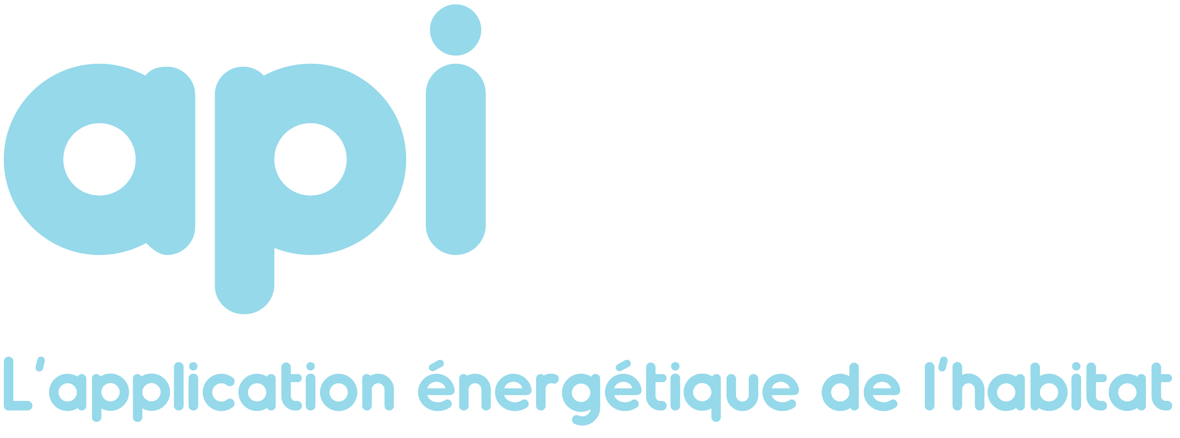
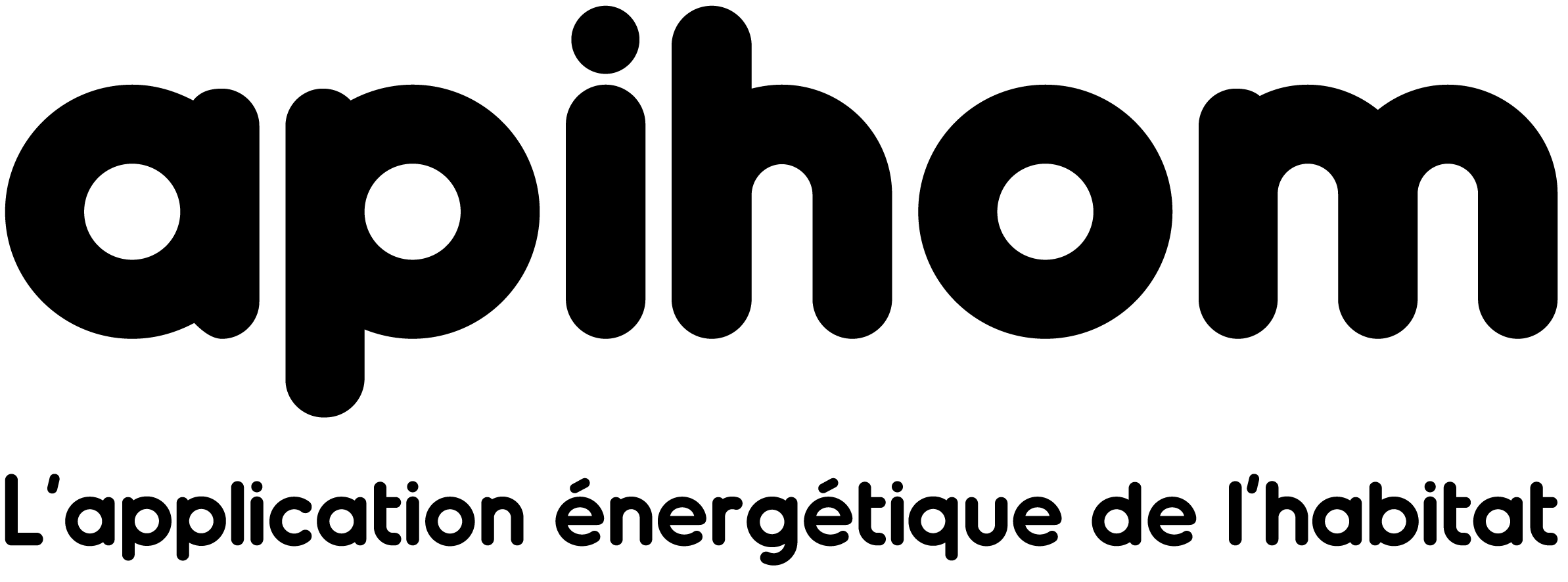
Logotype


Logo with baseline


Round mark
Loading symbol
Five animation stages. Sized variants (48–512) are available under /images/loading/sized/ for PWA icons.


Pictograms
Fond bleu


Fond transparent


Pattern
How to use
1. Static URL (zero install)
<link rel="stylesheet" href="https://style.apihom.com/css/theme.css">
<link rel="stylesheet" href="https://style.apihom.com/fonts/Oduda/font.css">
<img src="https://style.apihom.com/images/logos/baseline/bleu-clair-fonce.png">
2. npm git dependency
"apihom-style": "git+https://github.com/apihom/style-and-assets.git"@import "tailwindcss";
@import "apihom-style/css/theme.css";